Finaura
A fintech dashboard with a serif voice, one bright accent and a fully animated interface.

A fintech dashboard with a serif voice, one bright accent and a fully animated interface.
Product Designer
2025
Self-initiated
Web (Desktop)
Design a fintech dashboard that feels modern and fresh: serif type, a bright accent, a simple interface and soft motion.
A 60+ screen dashboard kit and design system in Figma, then every interface element animated into a live demo, built with AI.
A consistent system across 12 product modules, where every component adapts cleanly to wide layouts.
Finaura is a personal exercise and a showcase. No client, no brief: just the question of how modern a finance product can feel.
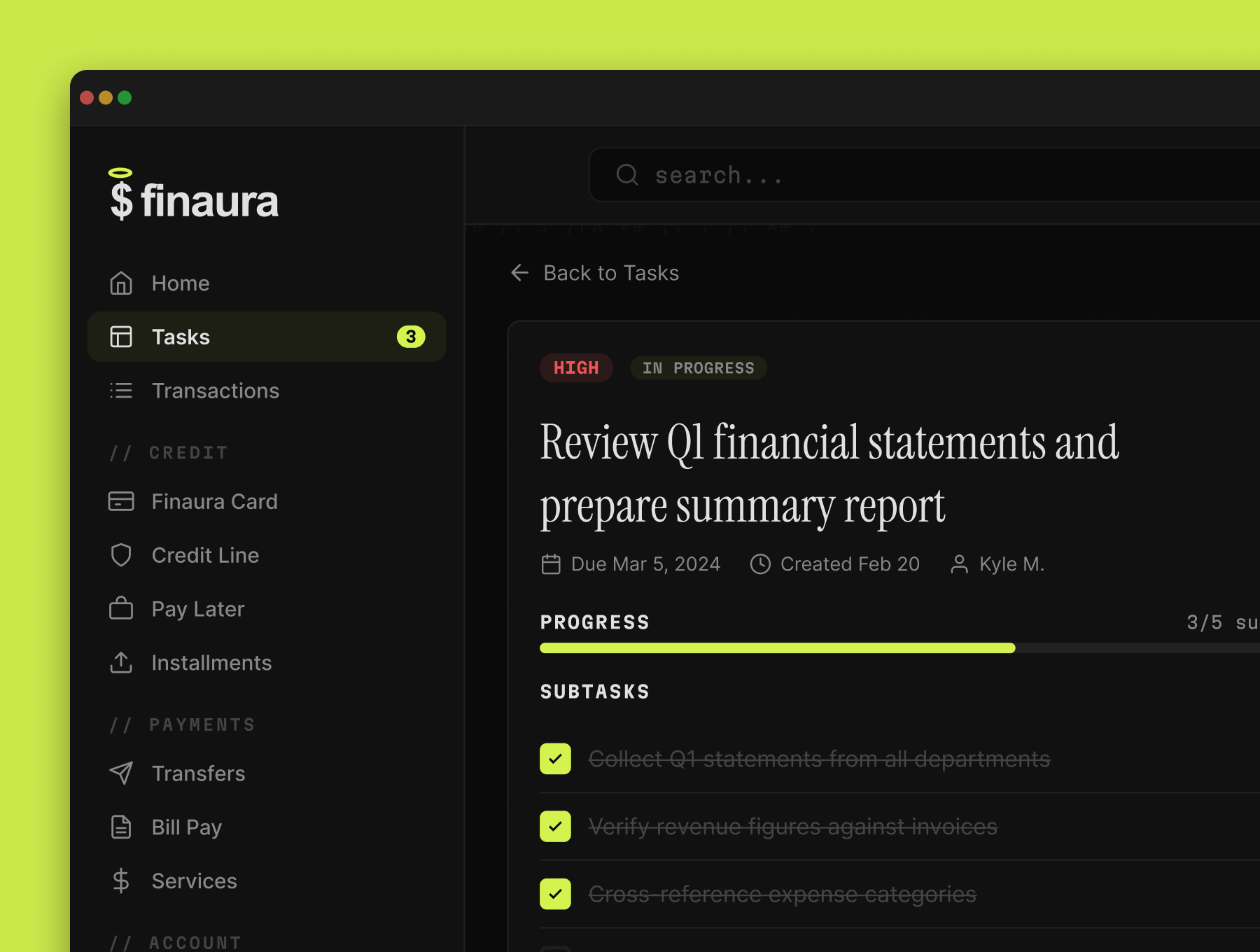
Serif headlines, one bright accent on dark, fewer elements and soft motion.
Every screen is judged against one question: does it feel current?
Italic serif page titles give a financial product a voice, not just a grid of numbers.
Lime on near-black carries every primary action and every highlight.
Much of what a typical banking dashboard shows at once was cut on purpose.
Nothing jumps. Every element has its own specified animation.
// CREDIT, // PAYMENTS, // ACCOUNT, echoing the monospaced labels.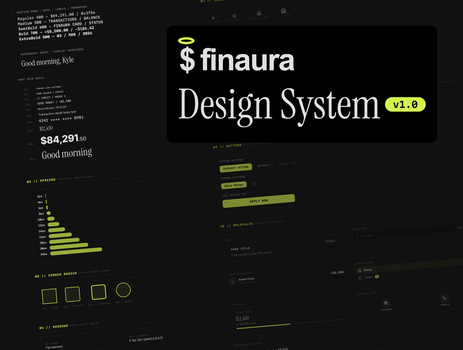
Home, Tasks, Transactions, Card, Credit Line, Pay Later, Installments, Transfers, Bill Pay, Services, Analytics and Subscription, plus sign-up. 60+ screens in Figma, all on Auto Layout.
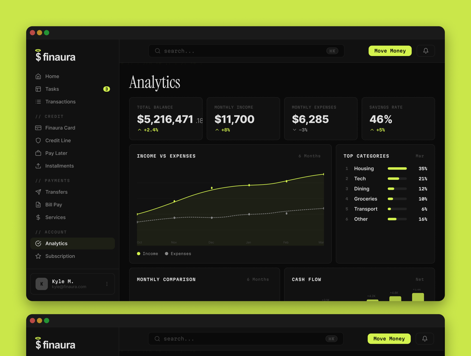
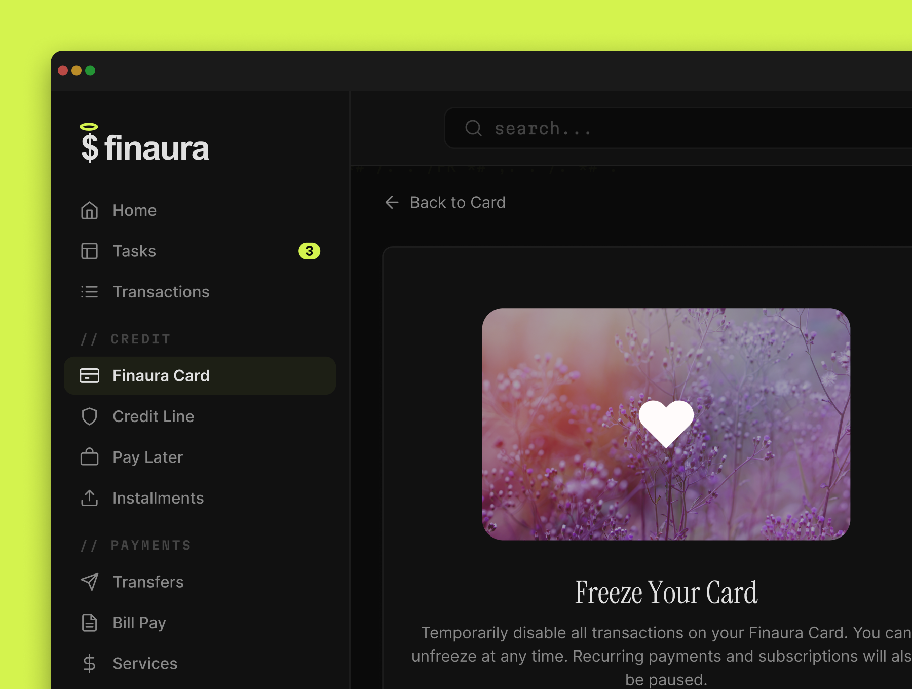
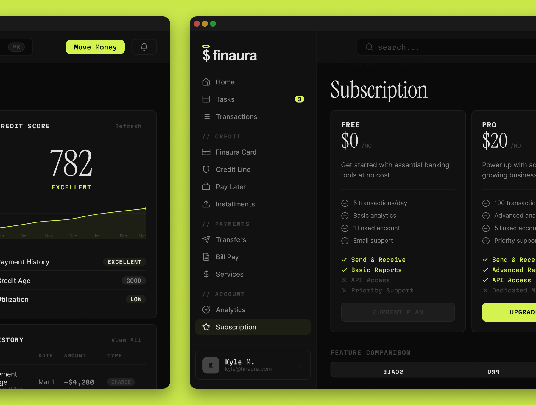
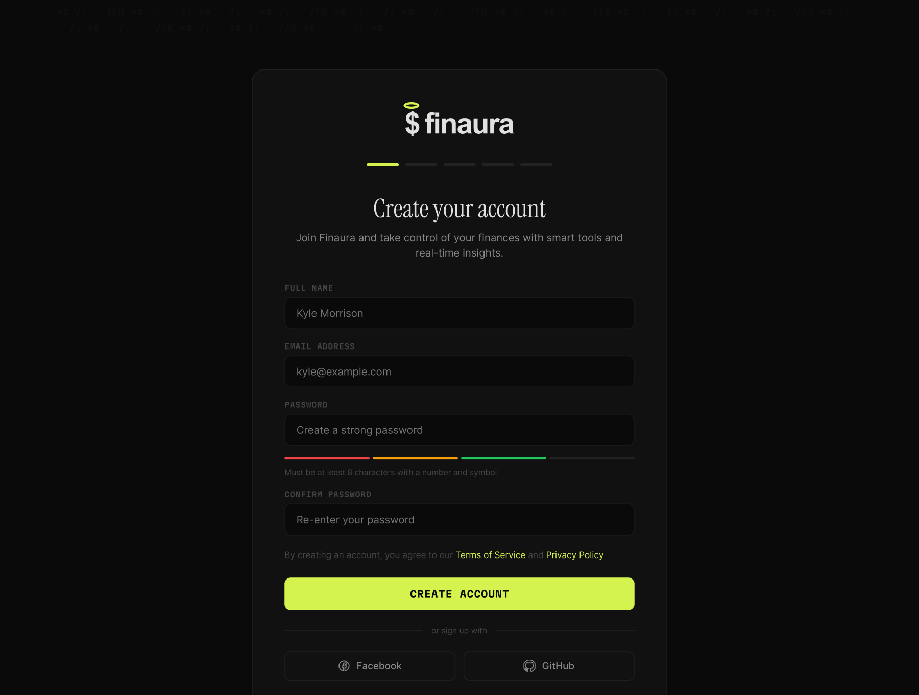
Each element's animation is specified, then put together into a working demo of the interface, built with AI. It's the fastest way to show how the system behaves, not just how it looks.
With shared tokens and components, 60+ screens stay in one style, and every element adapts to wide layouts without being redrawn.